Finding the “right” P-F interval with operational data patterns

Key Takeaways:
- P-F curves apply not just to reliability but to quality and yield as well.
- The “right” time for service depends on the relative costs of service and production losses (value at risk) at each point in the performance cycle.
- Detecting potential failure at the “right time” is hard and often requires multiple technologies. Existing operational data can be mined for patterns to detect indications of potential failure at the ideal time of service.
The P-F curve works not just to describe how equipment health evolves over time but also to express how entire systems like plants and process lines can change over time. This well-known and easily understood concept goes well beyond reliability or maintenance and applies equally well to performance issues such as quality and yield. Thinking about P-F Curves in this way greatly simplifies the discussion and adoption of AI to enhance operational excellence.
While much focus is put on finding potential failures (“P”) earlier in time, earlier also needs to be balanced with risk-weighted service cost. What the operations team really needs to know is: at what point does the cost of operating in the current condition become larger than the cost of service?
Assuming that resources and materials costs for the system stay relatively constant, there are two different costs to consider. The first cost, as shown in fig 1’s P-F curve, is the value at risk.
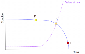
Fig 1 – The value at risk increases as system condition deteriorates.
When the system is in a healthy condition, the value at risk will be at its lowest. However, as time passes, and calibrations drift, parts wear and the system condition generally deteriorates, the ability to make good product is impaired. This means that the amount of bad product increases over time, eventually reaching a point where all of the output is unacceptable – a functional failure. At this point, the value at risk will be at its highest.
The second cost, as shown in fig 2’s P-F curve, is the cost of service.
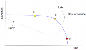
Fig 2 – Cost of performing service at different points in the system’s service cycle.
When a system is serviced very early in the service cycle, the complexity of the service is low. Therefore, the “necessary” actions can be scheduled and taken very quickly without impacting value being created. However the total cost of service may be higher because the number of service cycles per year will be high. Likewise, cost may be higher if service is done too late. In this case, the cost comes from longer, more complex service which substantially reduces system availability. It also comes from overtime costs and expedite charges as there is a high likelihood of unexpected failure when service is performed too late. Between “early” and “late,” there is some time range where service costs are minimized, representing a balance between the costs of increasing service complexity and performing more servicing per year.
Using these costs, it is possible to calculate an optimal intervention time as shown in Fig 3’s P-F curve.
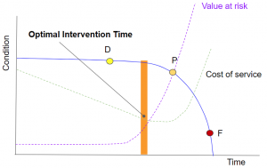
Fig 3 – Optimal intervention time is at the time which minimizes total costs.
By finding the time at which the sum of the cost of service and the value at risk is minimized, one finds the point at which system service should be performed. In the example shown in Fig 3’s P-F curve, the optimal intervention time is earlier in the system’s service cycle.
However, the “optimal” point is highly dependent on the shape of the cost curves. In another case, shown in fig 4’s P-F curve, the optimal intervention time is considerably later. There is no a-priori way of saying where in time this point will be. Earlier isn’t always better: Different systems require different service points for different causes.
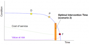
Fig 4 – A different set of cost curves results in a very different optimal intervention time.
Given the range of possible cost curves for different systems, different products and different operating cost structures, the operations team needs the flexibility to detect potential failures at a range of points on the P-F Curve.
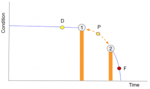
Fig 5 – The operations team needs the capability to detect potential failures (P) at a range of operating conditions on the P-F curve.
Our experience shows that leveraging patterns in operational data is one of the most flexible ways to detect specific precursors to failure. Because failure prediction needs exist across a wide range of systems, it is important that the operational experts be able to perform failure prediction work on their own. We believe these factors make Falkonry, with its capability to enable AI-based operational excellence, uniquely suited to optimizing service cycles.
For more information about the P-F Curve and how patterns help increase flexibility in finding the “right” potential failure (P) point, see the video below.